LoGo DeSiGN
From £150
Browse some of my recent logo design projects below and get in touch if you'd like to discuss a project
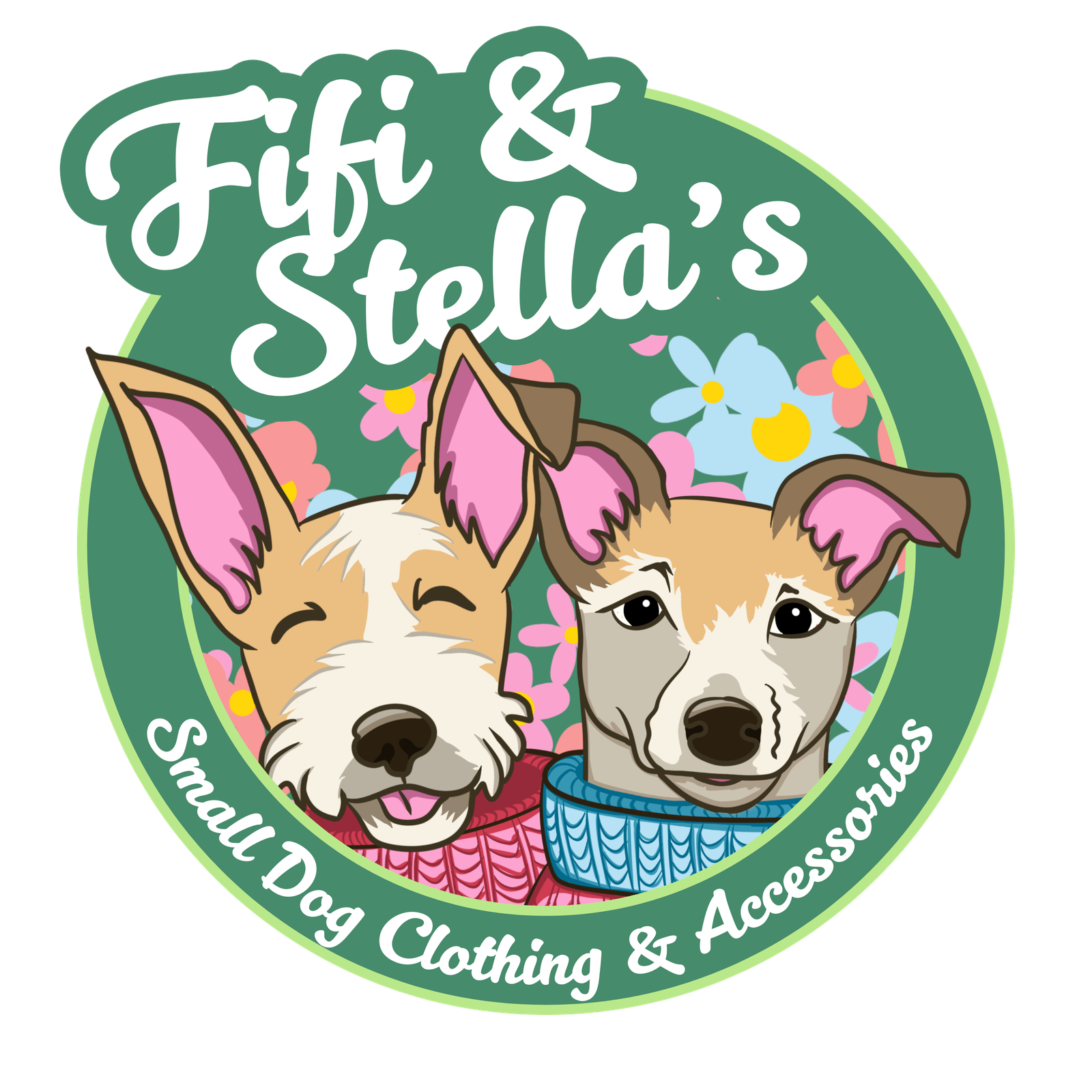
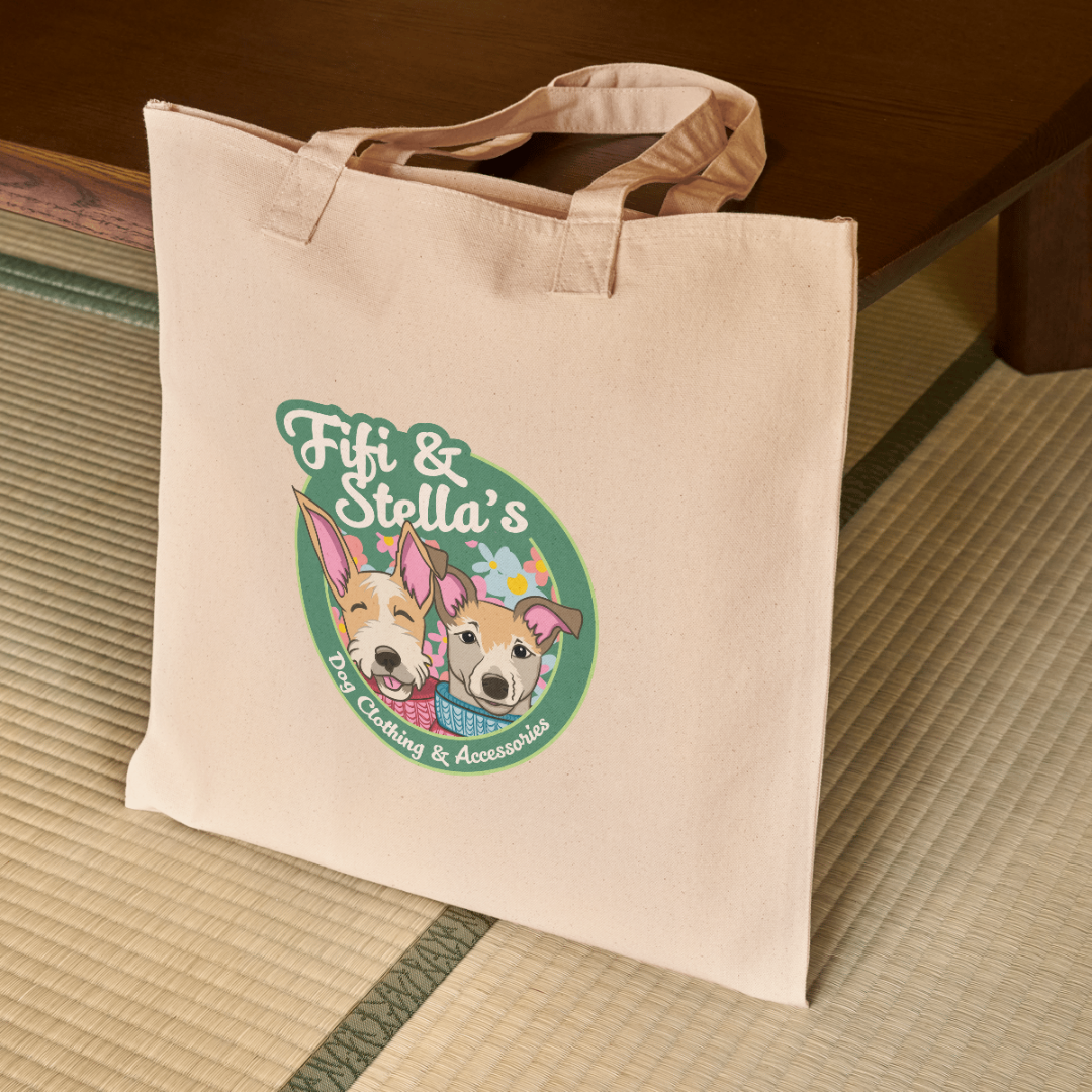
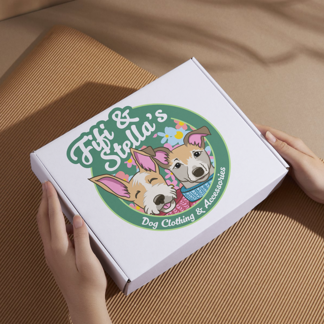
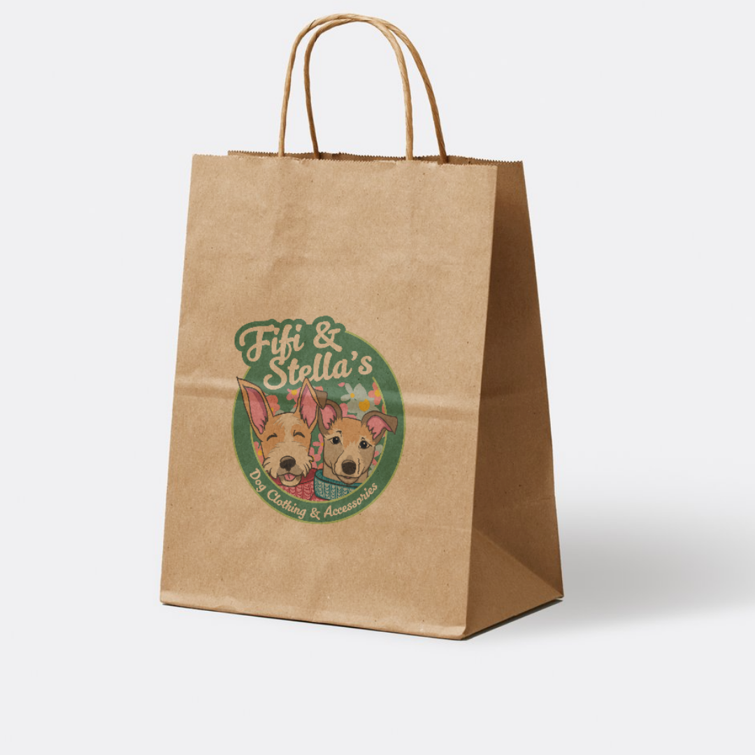
Fi Fi and Stella's
Working out the design for Fi Fi & Stella’s logo was all about capturing the heart of the brand – charming, cosy and full of personality. Specialising in hand-crocheted dog jackets and accessories. The brand is named after the client’s two beloved dogs, so I knew their presence had to be at the centre of the design.
I hand-drew the dogs Fi Fi and Stella to give the logo a personal, warm touch, making it feel as unique as the products themselves. To ensure a cohesive look, I took inspiration directly from the brand’s colour palette. I wove in tones that reflect the handmade, high-quality craftsmanship of the clothing and accessories. The playful yet polished typography and floral background bring in a soft, boutique feel while keeping the overall look fun and inviting.
I love incorporating hand-drawn elements into my logo designs, and this project was the perfect opportunity to blend illustration with branding. The result? A logo that’s as full of character as the little dogs (and the stylish products!) behind it.
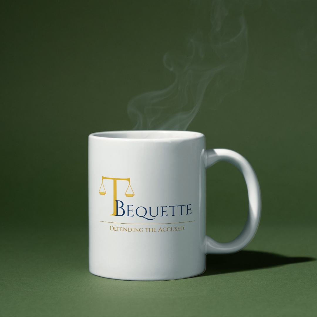
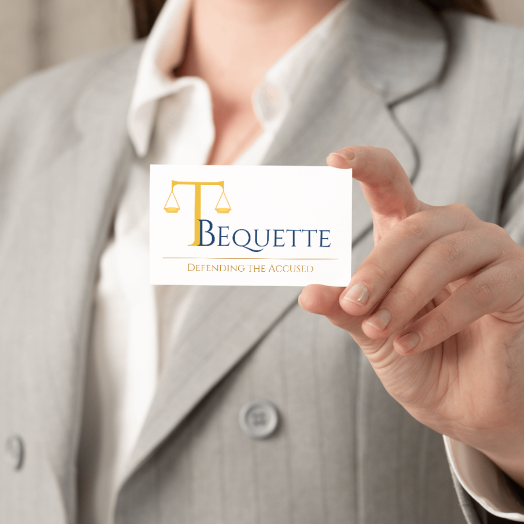
Tl Bequette
The T Bequette logo was designed to reflect the integrity, professionalism and expertise of a distinguished criminal defence attorney in San Francisco. The refined serif typography conveys trust and authority, while the golden scales of justice, seamlessly integrated into the “T,” symbolise fairness and balance – values at the core of the legal profession. The deep navy and gold colour palette further reinforces a sense of reliability and tradition, ensuring a timeless and sophisticated identity.
This logo was part of a comprehensive branding package, which laid the foundation for a cohesive and professional visual identity. From business cards to legal documents and digital platforms, every aspect of the brand was designed to maintain consistency and credibility, strengthening client trust and recognition. A well-crafted brand is essential in the legal field, where clarity and confidence are paramount.
Building on this strong brand identity, I also designed a website for Todd that reflects the same level of professionalism and attention to detail. The site offers a seamless user experience, with intuitive navigation, clear messaging and a design that reinforces the firm’s commitment to justice and advocacy. By combining thoughtful branding with a well-structured website, Todd Bequette’s online presence effectively communicates expertise and dedication to potential clients.
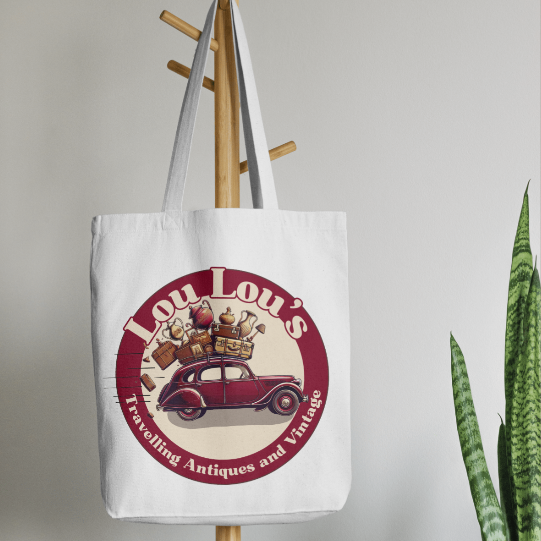
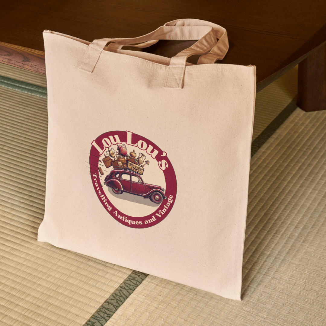
Lou Lou's Travelling Antiques and Vintage
When Lou came to me for a logo, she had a clear vision – a burgundy Peugeot 203 (just like the one she used to drive), packed to the brim with vintage treasures tumbling from the roof. I got straight to work, sketching out the perfect balance of nostalgia and motion, capturing the joy and adventure of her travelling antiques business.
This logo is digitally hand-drawn, ensuring every detail – from the classic curves of the car to the tumbling suitcases and ornate vases – feels personal and full of character. The rich burgundy tones and vintage-inspired lettering tie it all together, creating a timeless and memorable brand identity for Lou’s business.
Customisation and hand-drawn elements like these are all part of my bespoke logo design service. Whether you have a specific idea in mind or need help shaping your vision, I can create a logo that tells your story. Get in touch if you’re looking for a logo that’s as unique as your brand!

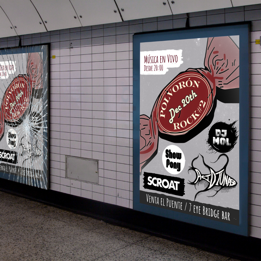
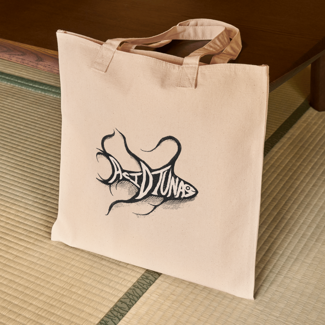
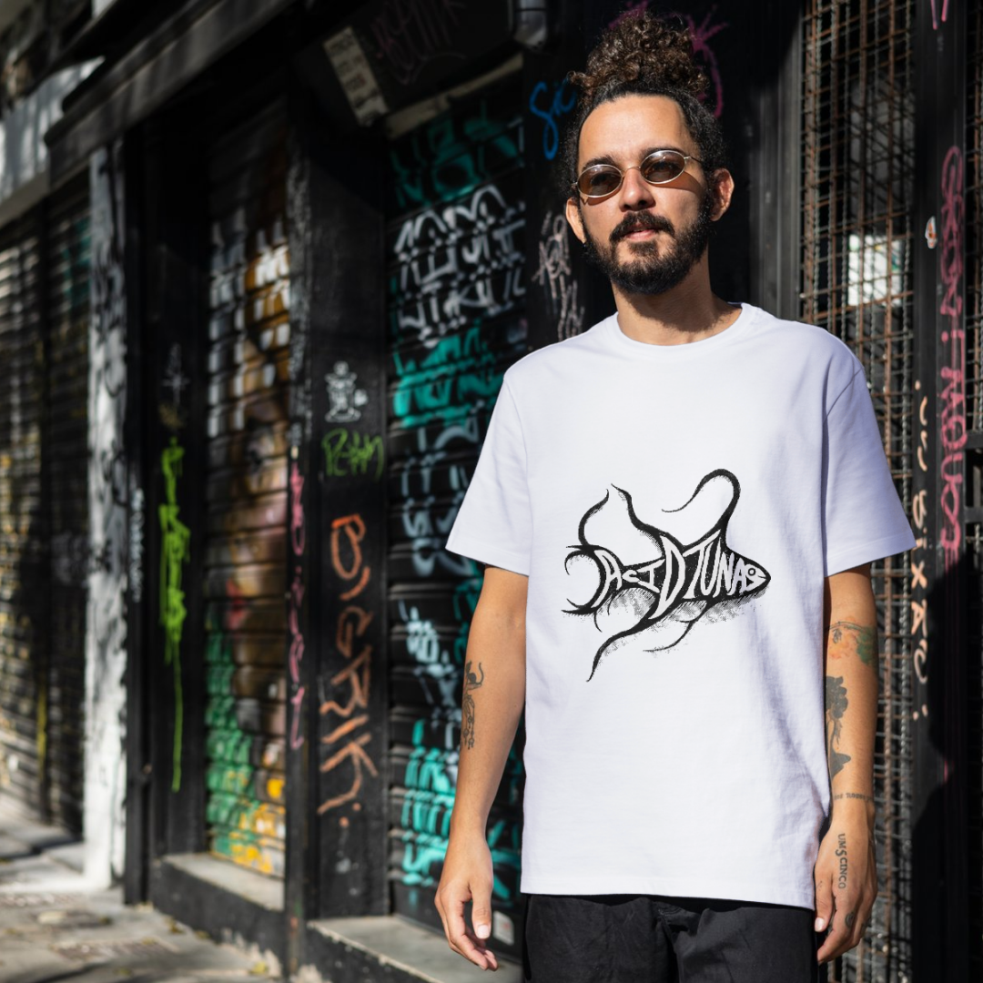
Acid Tunas - Band
Designing the Acid Tunas logo was a project that meant a lot to me, as it was something I created by hand for my own band. I wanted the design to feel raw, energetic, and completely unique – just like our music. The flowing, organic lines give the logo a sense of movement, while the hand-drawn typography merges seamlessly with the shape of the fish, making it feel alive and dynamic. Every detail was carefully crafted to reflect the band’s identity – bold, unconventional, and impossible to ignore.
As with every project, this logo wasn’t just about creating a striking visual; it was about building the foundation for a strong and cohesive brand. From gig posters to album artwork, the Acid Tunas branding needed to work across different formats while maintaining its distinctive character. That’s why I approach every branding package with the same level of care and attention to detail – ensuring each design feels authentic, memorable, and ready to grow with the brand.
This logo also became the starting point for the band’s online presence. Whether it’s a website, social media graphics, or merchandise, a strong visual identity ties everything together. By handcrafting a logo that captures the band’s essence, I was able to create something that not only represents us visually but also resonates with the people who connect with our music.
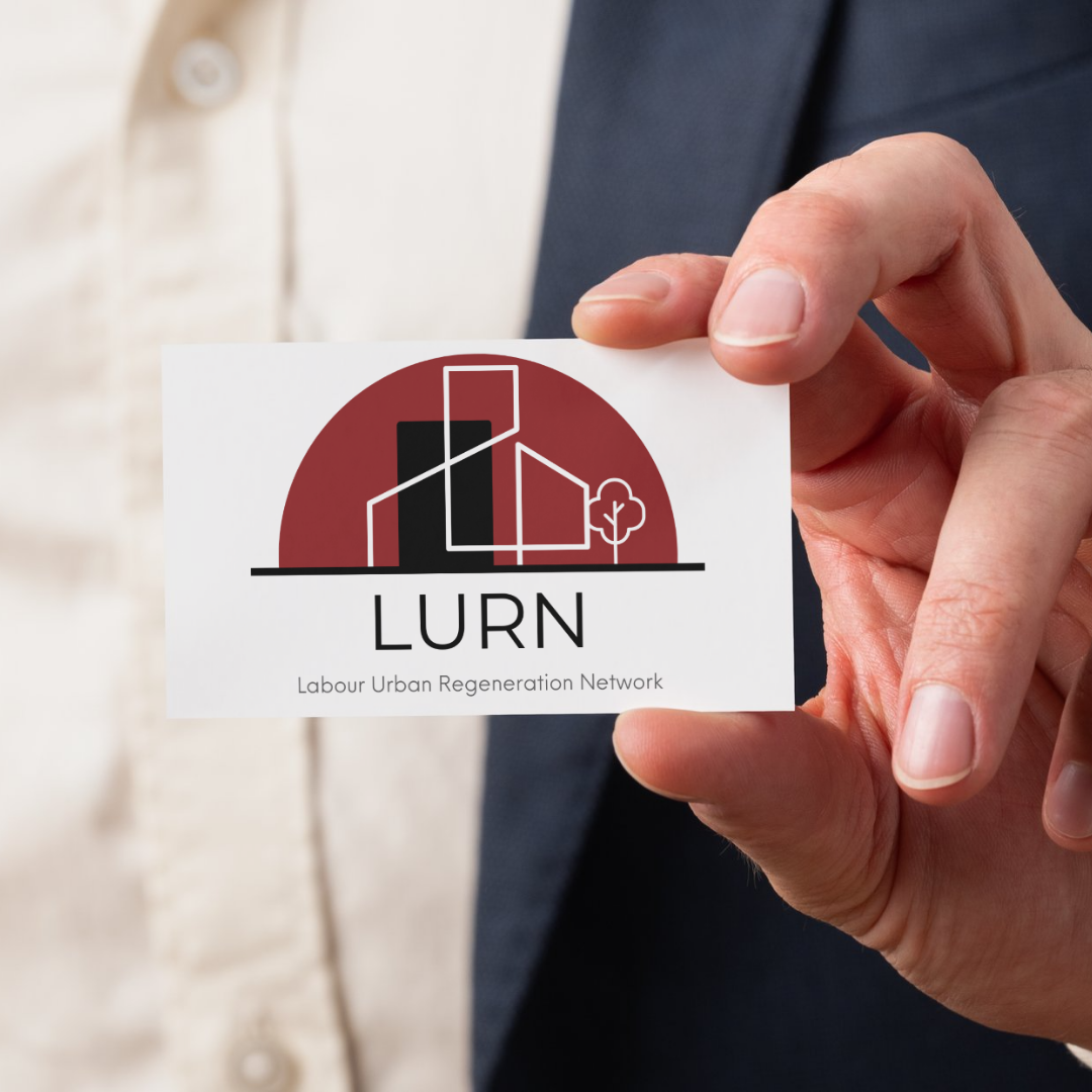
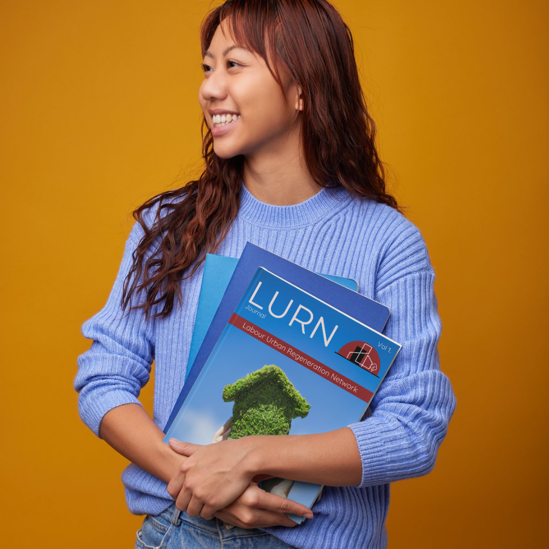
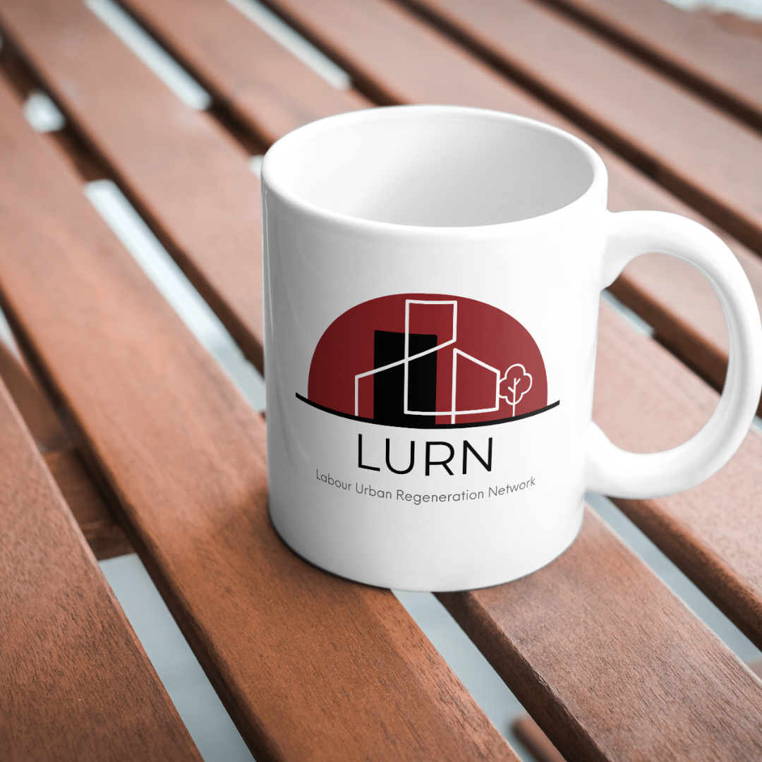
Labour Urban REgeneration Network
The Labour Urban Regeneration Network (LURN) needed a brand identity that reflected their mission of revitalising urban spaces and fostering sustainable development. The logo I designed captures this vision through bold geometric shapes, representing city structures and growth, while the deep red arch symbolises unity and progress. The combination of strong lines and open space creates a modern yet approachable aesthetic, balancing professionalism with a forward-thinking ethos.
This logo was part of a branding package that established a cohesive visual identity across all platforms. From print materials to digital applications, every element was designed to maintain consistency and impact. A well-defined brand is essential for organisations like LURN, ensuring they communicate credibility and purpose effectively to stakeholders and the wider community.
Building on this foundation, I designed a website that brings LURN’s mission to life online. The site is clean, intuitive, and visually aligned with the brand, providing an engaging user experience while effectively showcasing their work. A strong website is more than just a digital presence – it’s a tool for connection, advocacy and growth. With a clear brand identity and a seamless online platform, LURN is equipped to drive meaningful change in urban regeneration.